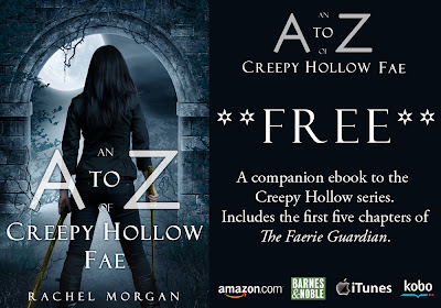
So A to Z went backstage, had a makeover, and here she is! The new and improved Creepy Hollow companion ebook!
New Covers for the Creepy Hollow series
And this brings me to my next announcement. For a while now (since before I revealed The Faerie War's cover!), I've been planning to redo ALL the Creepy Hollow book covers. This was a difficult decision because there have been many people who've said how beautiful they find the series' covers, and other people who've said they've picked up the book purely because they were attracted by the cover.
BUT I also feel as though people searching through the Kindle lists for something to download may see the Creepy Hollow covers and think the pictures represent stories that are more juvenile than they actually are. I think perhaps this series would attract more readers of the YA fantasy/paranormal genre if they looked a little more like the new A to Z cover up there.
BUT I still love the original covers, and I think they look completely gorgeous in print.
SO, here's what I plan to do: I'm keeping the original covers for the print versions and doing new covers for the ebook versions.
Do you want to help reveal these covers?
I'll be revealing these new covers on Thurs Dec 5. I know there are so many cover reveals going on all the time, so if you're tired of them and don't want to take part, I totally get that. But if you do want to help out by sharing the new covers, please leave your email address in the comments below.
THANK YOU!
 |
| If you'd like to share this image anywhere online, please feel free! |
~ ~ ~
On a much sadder and more serious note ...
A red balloon for Andrew McNaughton, the stepson of Nick Wilford.
Sadly, Andrew passed away recently and his funeral is being held today.
Andrew is the boy who inspired writers across the globe to write
an anthology of stories entitled Overcoming Adversity.


12 comments:
I do love these covers (you're right they look fab in print), but I'm sure whatever you come up with for the new ebook covers will also look awesome.
The new A-Z cover is gorgeous. I love the subtle changes to the original cover.
Count me in for the reviews. My email is claredugmore@gmail.com. :D
I may be doing a new cover for something soon, too. And why not? Traditionally published books get new covers all the time.
While I love the current covers I must agree with you about what attracts the fantasy/paranormal crowd. I think it's kind of like the American versus British book covers. American covers are usually more 'lively' because that's what attracts those readers. Sometimes I find British covers too subdued but you have to do what attracts your audience. I'm glad you're keeping the designs for the print version and the new A-Z cover rocks hard.
You know I'm in for your next cover reveal. Email: queendsheena@hotmail.com
I do understand the need to brand a series with a similar look. You have to decide the way you feel is the best. I do love the originals and they draw my eye quicker because of the beauty of them. :-)
Sia McKye Over Coffee
I wouldn't change the new ebook covers too much, but it's a great idea! I'm sure you've got something great in mind. ;)
I want to help with the cover reveals next month: ckeaton[at]gmx[dot]com.
I would love to help with cover reveals.. sometimes a cover change can do wonders...mladycammy at yahoo dot ca
Your covers are awesome, but I gotta admit that the girl on the cover above has a kick-ass quality that makes the cover even more interesting. Count me in for the rebranding. Email addy is jmwordsmith at gmail dot com
Best of luck with the cover reveals. I'd do it (any other time) but I'll be just back off holiday, prepping for visitors. :( I'd have to say, the covers you already ave are awesome, can't imagine what they'll be like. Bet you've chosen something awesome. X
shahwharton.com
Hi Rachel,
I would love to help :)
Theunofficialaddictionbookfanclub@hotmail.com
The new covers rock, but I also liked your old ones.
Love the new cover for A-Z! And can't wait to see the new covers for the trilogy! I like that you're keeping the print ones the same and having new ebook ones. Good idea!
Love the new cover for the A to Z. Looking at her back is mysterious. Don't know if it's too late to jump in on the cover reveal, but if it's not, I'd love to participate. Email me emilyann(at)thelabyrinthwall(dot)com or you can use my other email, since you probably still have it :)
Happy Thanksgiving =)
Post a Comment