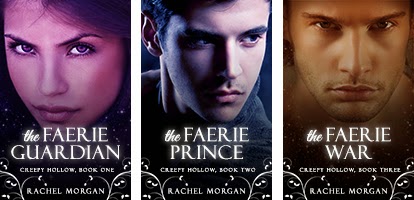
I am soooooooo excited to reveal these new covers! I love, love, love my original covers in print. They look so cool on the paperback copies on my shelf. But these new covers look super kickass on the ebooks. So without wasting any more words (because I know you'll just scroll down anyway ;-) ), heeeeeeeeeere they are!!
A little more behind the process...
Any designer who is also a writer will tell you that the hardest book covers to design are one's own. I struggled to come up with a set of covers that I LOVED! Several months ago, before I revealed the print cover for THE FAERIE WAR, I designed a new set of covers for the Creepy Hollow ebooks. Here they are:
I really liked these covers, and they looked super cool close up, but I realized after a while that at thumbnail size it was difficult to see what was on them. There wasn't enough contrast between the background and the model on each cover. So ... I started again. And here's what I came up with the second time:
I liked these covers too, and I really wanted them to be the final version after all the time I spent on them, but when I was honest with myself, I still didn't LOVE them. *sigh* So it was back to the beginning AGAIN. And this time I decided to go with something simpler. Those other covers were cool, but there was just too MUCH happening on them. You know what they say -- less is more ;-) And this time, when I was done, I LOVED the covers. Third time lucky!
Giveaway time!
My Facebook page recently reached 1000 likes. Woohoo! So I'm having a little giveaway to celebrate. You can enter below :-)
a Rafflecopter giveaway


14 comments:
I have to say that I think keeping the glitter is best and the first two new covers are really good. My issue is with the third which after the first two with vibrant colours just looks brown and bland in comparison. But I will say the model looks strong and angry in the third which what I'd imagine the character to be in that point of the series.
I didn't plan to post on my blog today so I'm putting the covers up on my facebook page today and adding them to my Friday post tomorrow. Congrats on the new covers and thanks for the giveaway. Writers have to expand and change and your changes can only expand your franchise to new readers.
I feel your pain, Rachel! Congratulations. :)
Thanks for sharing the covers, Sheena!
Perhaps it's your computer screen that's making the third cover look brown and bland? On my laptop it comes across as sepia and a bit muted, but on the iPad and iPhone the colour is deeper and closer to a burnt orange. (That's one of the things I don't like about designing covers. I never know how the colour will display on every other brand of computer screen out there!)
Carrie, I assume you design your own covers, so you'd definitely understand!
New covers look great! Although I like all of the potential options.
All of those covers are soooo pretty! Congrats :)
I love the new covers. I just read the series over the last couple of weeks, and I loved it - I couldn't put it down. So, thanks for that :)
I love the new covers! And I like how you showed the progression of them. They were all great, but I agree sometimes simpler can be a little bit better, and I like showing the main characters across the books. It fits very well with your series.
Thanks, Alex and Juliana!
Laura - Yay! That is such a fantastic thing to hear!
Cherie - Yeah, I think this was a case where simpler is definitely better. I don't want the other covers to go to waste, though, so maybe I'll use them for promotional graphics somewhere along the way.
Beautiful covers!!!
I'm not really a fan of covers that are just faces of characters. They're very popular, though, so I suspect that's just me.
So, yeah, I like the old covers better. (Still on the print copies, if I'm reading that correctly?)
Anyway, I'm using one of those images in my post for Monday. yes, that means you'll have to come see why I have one of your covers in my post. :P
Oh my gosh, these new covers are so fabulous! They work perfectly as ebook thumbnails. You definitely improved the covers! :D
I love the new covers! And I'm so glad you shared the other ideas and your process. It's so helpful. There are so many things to consider (like the smaller version seen on most websites).
So excited about these covers. You did a great job. And I'm currently reading The Faerie War... awesomeness! I'm excited to find out what happens next but dreading the end of the series. =)
More Creepy Hollow books? Just maybe?? If I say please? =)
Post a Comment